01 - Summary
Summary
Inventa is a B2B marketplace where shop owners buy from distributors to resell. What held the business back was in the buying journey: low checkout conversion, difficulty building large bulk orders, which is this buyer's default behavior, and recurring bugs in items and menus that broke the flow midway.
The coupon field concentrated part of the problem, with a direct weight on first purchase and repurchase. Fixing this in a single place solved little. The product lived across four surfaces at the same time, a Shopify site, an in-house platform under construction, an app and a supplier portal, and shop owners moved between them.
Any journey fix had to be done four times, in a quarter when 100% of the front-end team was allocated to the migration from Shopify to the in-house platform. I joined as a Product Designer at an unstable moment, with product leadership having just left and the design team growing from 2 to 6 people with no lead.
I took the lead on the project: I researched shop owners, suppliers and developers, turned the findings into a conversion and delivery-capacity argument and got priority from the CEOs outside sprint planning. The design system came in as the means to make the redesign exist across the four surfaces, with a v1 scoped by implementation feasibility and installed inside Shopify itself.
In 4 months, the redesign, the new visual identity and the v1 were live.
02 - Product
Product
Inventa is a B2B marketplace where shop owners buy from distributors to resell. The product lived across four surfaces: a Shopify site, an in-house platform under construction, an app and a supplier portal.
03 - What held back buying was in the journey
What held back buying was in the journey
The diagnosis with shop owners pointed to three concrete issues. Checkout conversion was low. Building large bulk orders took disproportionate effort for people buying to resell. And bugs in items and menus broke the flow in the middle of a purchase.
The coupon field showed up as a lever on both sides of the marketplace. Coupons drove first purchase and repurchase at the same time, and they were poorly solved at both ends: suppliers had nowhere to create campaigns, and shop owners had nowhere to find what was active.
32% of the base only bought when a coupon was available
21.3% of shop owners bought only once and never came back
93.7% of developers redid work due to lack of a standard
The design review cycle took 3 days per delivery
With no shared library, every journey fix turned into four different implementations. Both diagnoses converged on the same point. The conversation with leadership stopped being about visual consistency and became about conversion and about the ability to fix the journey with the front-end unavailable.
04 - The three decisions that set the course
The three decisions that set the course
Treating the journey fix as a system problem.
The direct route was to fix checkout, coupons and menus screen by screen, inside Shopify, and move on. That would deliver results on one surface and leave the other three with the old journey, while repeating the same rework that was already consuming the team. I designed the fix as a component, not a screen. Each journey adjustment flowed down to the four surfaces from a common foundation. That decision is what turned a checkout redesign into a design system project, not the other way around.
A small v1, born inside the legacy.
The Shopify migration was the company's declared priority and consumed the entire front-end. A system that required development capacity to exist would never leave Figma. I implemented the v1 inside Shopify itself, with components ready to migrate along with the product as the team freed up room. The scope was cut in a workshop with designers and developers, using an effort-and-impact matrix, prioritizing the components of the buying journeys and those that fixed the most recurring item and menu bugs. The price was residual inconsistency for longer and components chosen by implementation feasibility, not design need. In the scenario that existed, a complete system would have become documentation without adoption.
Tools chosen by the people who would implement them.
Storybook and Zeroheight were chosen by 80% of developers in a survey, and four of them had built a design system before. I gave up choosing the tools and used the team's prior experience to define component naming and granularity. Documentation lived in the devs' workflow. Adoption was treated as a project requirement, not a step after launch.
05 - The journey redesign
The journey redesign
Checkout.
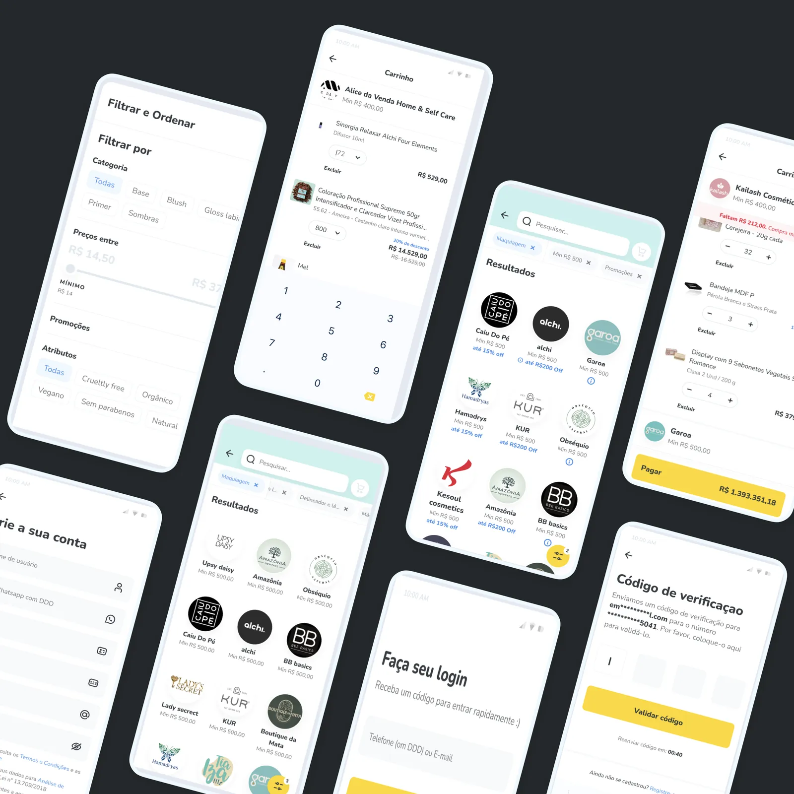
Funnel analysis showed that checkout concentrated the main conversion loss. We prioritized fewer steps, clearer order information and recovery from the errors that interrupted the purchase. After launch, checkout conversion increased 19%.
Bulk ordering.
Interviews showed the flow had been designed as a retail purchase, while the predominant behavior was building orders with many SKUs and large quantities. We reprioritized the experience for that scenario: products were grouped by supplier, quantities could be adjusted directly in the cart and rules such as minimum order and pack multiples became visible before checkout. The decision reduced rework when building orders and tackled one of the main causes of abandonment identified in discovery.
Coupons.
The data showed a relevant dependence on this mechanism: 32% of shop owners only bought when a coupon was available. We split the problem into two capabilities. The first was letting suppliers create campaigns with different commercial rules; the second, making sure shop owners could find and apply the available benefits. Since the most immediate impact was on conversion and repurchase, we prioritized the shop owner's experience in the first cycle. Advanced campaign creation was defined and prototyped for a later stage.
Items and menus.
Errors in these components interrupted critical journeys and reappeared across different products. Instead of treating them as isolated fixes, we prioritized the structural cause: the components were rebuilt in the shared library and distributed to the four surfaces. That reduced recurrence, rework and divergence between implementations.
06 - The architecture: one foundation and four surfaces
The architecture: one foundation and four surfaces
The system was split into five libraries. A master one with the shared foundation: tokens, typography, grid, the new palette and component states. And four consumption libraries, one for each surface: web, Shopify, supplier portal and app. Each surface inherits the foundation and keeps only what is specific to it.
The practical consequence showed in the new visual identity, with a new logo and colors flowing down to the four products from a single point. That is what made it possible to deliver the journey redesign and the identity in the same 4-month cycle.
The foundation was also brought to the app MVP, together with another designer, building on six months of existing discovery. That work involved journeys, a proto persona, flows and WCAG 2.1 compliance, with components adapted to native iOS and Android patterns.
07 - What I take to other contexts
What I take to other contexts
A journey problem repeated across four surfaces is a system problem.
The decision that unlocked the project was to stop fixing screens and start fixing components.
A design system gets approved with conversion.
Leadership prioritized it when the topic became checkout and repurchase, not when it was standardization.
The implementation constraint is part of the design.
With the front-end unavailable, the right architecture was the one that could be born inside the legacy environment.
08 - Tools and methods
Tools and methods
- Figma, Storybook, Zeroheight, Hotjar
- Desk research, interviews with shop owners and suppliers, quantitative research with the development team, CSD matrix, benchmarking, effort-and-impact matrix, ideation and roadmap workshops
- WCAG 2.1, proto persona, journeys and flows